
Optimizing Your Law Firm Website’s Navigation for SEO and User Experience
 Setting up the navigation for your law firm’s website can be tricky business. The navigation and menus on your site are important for both the user experience and your site’s SEO (search engine optimization). The two don’t always agree with each other, but if you follow some best practice suggestions, you can achieve a good balance.
Types of Website Navigation Menus
There are a number of designs you can choose from when it comes to your navigation menu. Choose one that you feel aligns best with your branding and style.
- Horizontal navigation– This is a very popular design type. The labels for your menus will run horizontally across the top of your screen. This type is very user-friendly.
- Dropdown navigation– Similar to horizontal navigation, this design runs across the top of your screen horizontally. However, each main topic listed will lead to a number of pages in a drop-down menu when hovered over. This is a good choice if you have many subtopics to navigate to, such as practice areas.
- Hamburger menu– These are the three horizontal lines that appear in the corner of a website. When clicked on, they reveal a list of pages the user can navigate to. This is a good choice if you’d like a very clean and minimalistic design.
- Sidebar- This is when all pages live in a side panel.
Don’t Use Generic Terms
As you go from one site to another, you’ll see plenty of menus filled with the same words over and over again. How many times have you seen “Products” or “Services” listed as prominent options at the top of a website?
While these seem like natural choices on first thought, these words really don’t do anything to help users or search engines. Think about what someone might type in if they’re searching for topics related to your law firm. Are they more likely to be searching for a generic term like “legal services” or something more specific like “criminal defense” or “divorce attorney”?
Using more specific terms will tell the search engines and users what your website pages are about. This makes it easier for users to find what they want and improves search engine ranking for relevant keywords. Your home page will have more relevant keywords on it, and the pages those links point to will rank higher for those keywords, too.
Add a Search Bar
What better way to help users find exactly what they want than by having a visible search bar? This way users can quickly search for what they need if they can’t easily find a page quickly.
Limit the Links on Your Home Page
The front page of your site will have the most authority with the search engines. This authority gets divided up and passed down to each page you link to from there. The more pages you link to, the more diluted this authority boost gets, lowering the chances of good ranking for your site’s internal pages.
The general rule of thumb is to limit main navigation to seven links at most. Keep the links descriptive and concise. This will give you the maximum SEO benefit as well as reduce the chance of confusing site visitors.
Navigation Order is Important
It’s proven that when items are put in a list, the human brain tends to remember things at the beginning and end of the list, with items in the middle being the most often forgotten. Basically, this means people will notice the items that appear first and last in your navigation the most, so this is where you should put the most popular items. If you’re not sure what items are most popular with your visitors, just take a look at your site’s analytics.
Consolidate Pages Where Possible
Dealing not so much with the menus themselves, but with the pages they point to, you should always try to consolidate similar pages into a single, more comprehensive page whenever possible.
On the SEO side of things, this reduces the dilution of authority that we talked about earlier. A single page with more detailed and comprehensive information about a topic will always rank better in search results than three or four pages with sparse information on the same topic.
For your site users, it should be obvious that it’s easier for them if they can find all the information they’re looking for on a single page instead of having to jump back and forth through various pages to piece things together.
Related: SEO Basics in an Hour [On-Demand Webinar]
Check and Rework Designs Over Time
As your law firm’s site grows and evolves, it may become necessary to rework your menus and change site structures. It’s important that your navigation reflects changes as some things are moved, or even removed, and other things are added.
Plan Design with a Sitemap
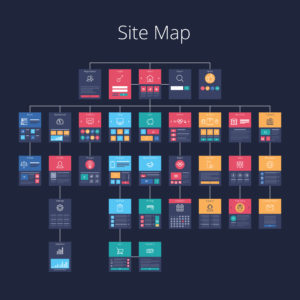
It can get confusing trying to keep track of all your different pages and how they should interrelate in navigation. Plan out your tabs and navigation drop-downs with a sitemap first. Have a few different sets of eyes look at it to ensure it makes sense.
Use a Sticky Menu
Isn’t it annoying when you have to scroll all the way to the top again on a site in order to click on another page? That’s where sticky menus come in. You can set up your menu so that it stays put even as users scroll down. This leads to improved user experience.
Related: SEO for Law Firm Websites eBook
Takeaway:
Taking a regular look at your site’s analytics should give you some good insights into how users are interacting with and moving through your site, too. If you’ve got a section that seems to be underutilized, it could be time to revisit your navigation system.
Contact us today for a free consultation if you’d like to get started with redesigning a site that’s optimized for search and user experience.
This post has been edited and republished from Oct. 21, 2017.

Are you ready to get started generating new, qualified leads?
Contact us to get started and let us help you energize your digital marketing and business development efforts.
Contact Us