
Law Firm Landing Pages: What to Do, and What Not To
 There’s a reason A/B testing for landing pages is so common. It’s because making even small changes can significantly impact the conversion rate of a page. Tiny things like button placement and colors can affect how many people are willing to click on your call to action. However, there are a few things that all great law firm landing pages have in common. Stick with this framework as your guide, and you’ll be off to a great start.
Make sure people know it’s a landing page
The page should be obvious and everything should be very clear to the reader. Think of it this way: If someone clicks on a landing page, they have some knowledge of your firm or the challenge you can help them with. That is, they have some background information. They also have some idea of what might come next. Be as up front as possible. There’s no need to be overly clever – make information as evident as possible, as early as possible.
- Use a big headline with strong, precise language.
- Create a short sub-heading to help explain the headline.
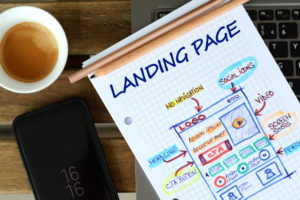
- Leverage images for a purpose and not just to fill up space. Try to help viewers feel the significance of the service you’re offering.
Make the most of people’s curiosity
In the case of the legal industry, you aren’t selling a product. The conversion rate you’re looking for isn’t simply clicking to a product and purchasing it. There are more steps to take, and that’s what you want a prospective client to do. Engage their curiosity – make sure they want to learn more, and point them directly to how they can do so. Users have to understand that there is more to know, and they will have access to that knowledge if they click the call to action button.
Remember: Pain is a powerful motivator
To click, the reader of your page likely needs to feel some pain. Select verbiage that gently reminds them of the pain (the problem or challenge) that they’re feeling, that you can alleviate. Once you remind them of the pain, quickly show them how you can help relieve it. For example, a family law firm might highlight the stress of splitting up assets during a divorce on the landing page. That calls to mind a strong pain point for individuals going through a divorce. Their sub-head might say “Don’t let your partner take it all” with short copy and a call to action to click for more information.
In terms of what not to do, here are a few common mistakes we want you to avoid.
- Creating long forms that no one will fill out
- Using generic calls to action
- Not considering context – that is, how a user got to the landing page in the first place
- Over-designing and making the page complicated or unclear
- Not using persuasive language
We’re experts at helping law firms develop landing pages that win new business. If this is an area you’re struggling with, let’s have a conversation!

Are you ready to get started generating new, qualified leads?
Contact us to get started and let us help you energize your digital marketing and business development efforts.
Contact Us